In the second part, I define the CSS styles.
DO IT (5 part series)
CSS Sections
I separated the CSS file into three sections:
- Theme variables: defines light and dark theme variables
- Soft reset: applies a simple reset
- General styles: other styles
Theme variables
By default, variables are initialized with light theme colors. However, if the browser identifies a preference for dark theme through the media query, the variables are reset to dark theme colors.
index.css
/* ======================================== Theme variables======================================== */:root { --background-color: white; --foreground-color: black; --text-color: red;}@media (prefers-color-scheme: dark) { :root { --background-color: black; --foreground-color: red; --text-color: white; }}Soft reset
For ease of styling, margin and padding are set to 0, and box-sizing to border-box for all elements, via the * selector.
index.css
/* ======================================== Soft reset======================================== */* { box-sizing: border-box; margin: 0; padding: 0;}General styles
Other styles, the highlights being:
- Line 16: the
perspectiveproperty defines the distance between the screen and the user's eyes, giving perspective to an element positioned in 3D,div.wrapperin this case - Line 20: the
transformproperty rotatesdiv.containeron the x and y axes. Initially, the values rotatediv.containerto the top left of the screen - Lines 29 and 30: the
text-shadowproperty draws 50 shadows on thediv.textelement, giving the impression that the text is solid and three-dimensional, as each shadow is close to one another. Initially, the shadows point to the bottom right of the screen
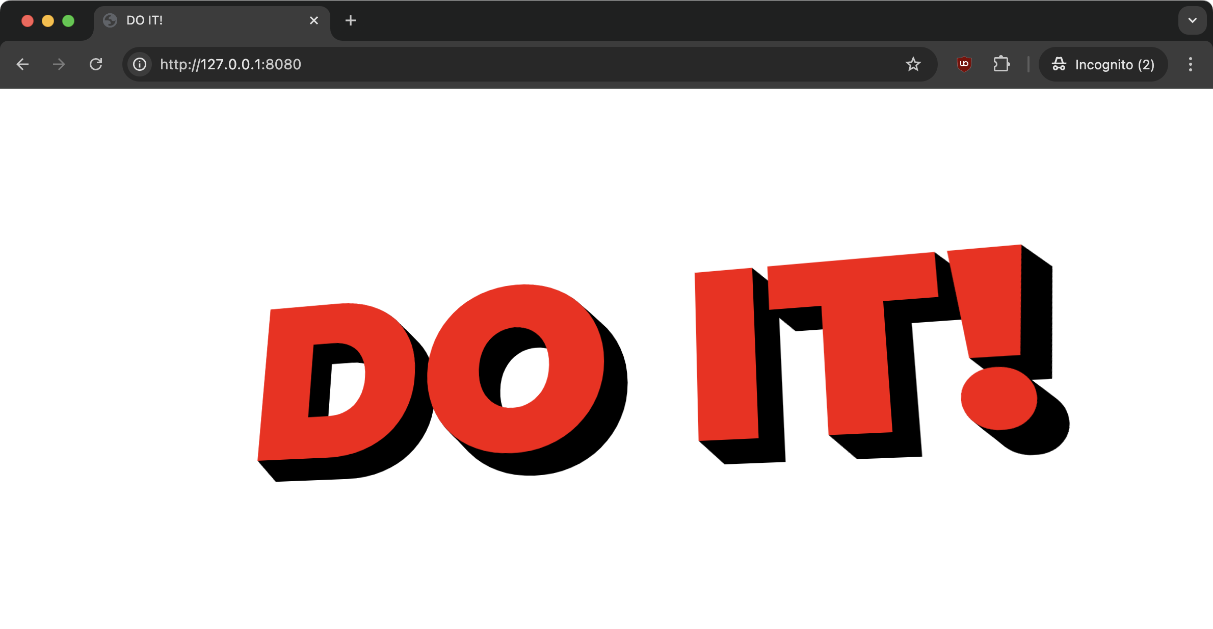
Together, the perspective, transform and text-shadow properties create the three-dimensional effect.
index.css
/* ======================================== General styles======================================== */html { font-family: "Montserrat", sans-serif; font-weight: 900; background-color: var(--background-color);}.wrapper { min-height: 100dvh; display: flex; justify-content: center; align-items: center; perspective: 1000px;}.container { transform: rotateX(14.5082deg) rotateY(-14.9276deg);}.text { font-weight: bolder; font-size: 20vw; text-transform: uppercase; color: var(--text-color); text-align: center; text-shadow: 0.039806996381182146vw 0.038688524590163934vw var(--foreground-color), /* 49 more shadows */;}Current result
With the styles defined, I got the following result:

Conclusion
Having defined the style, I moved on to interacting with JS: DO IT part 3: JS.