In the final post, I write my final thoughts.
DO IT (5 part series)
Experiments
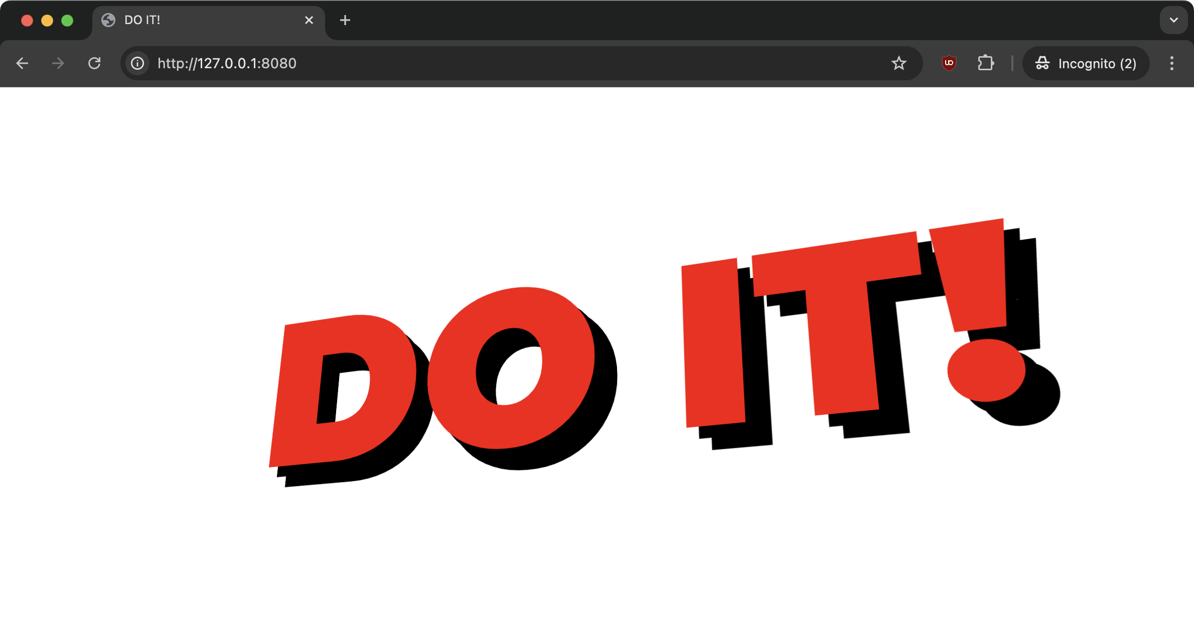
It was necessary to experiment a bit with perspective and shadows.
After experimenting with perspective, I decided to use 1000px, because smaller values caused more distortion than I wanted, while larger values caused less distortion.
After testing shadows, I decided to use 50, because larger amounts had a noticeable impact on animation performance, while shadow amounts lower than 50 gave a more noticeable jagged effect, compromising the solid effect of the letters. Here's an example with two shadows, to make it clear:

Possible improvements
Reduce the frequency of mousemove event updates by debouncing or throttling, reducing CPU load.
Set a lower number of shadows for smaller screen sizes. Not only do smaller screens not need as many shadows to create the solid letter effect as larger screens, but decreasing the number of shadows also reduces CPU load.
These improvements can help keep animation smooth even on lower-end devices.
Conclusion
I believe that the illusion of three-dimensionality created was convincing. I was impressed that I was able to achieve the desired effect by manipulating just two CSS properties.